Tech Titans: Twitter's Radical Rebranding vs. Facebook's Subtle Logo Tweak
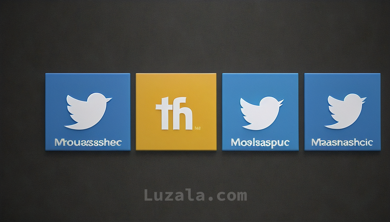
In a recent rebranding, X (formerly Twitter) introduced a new logo, while Meta subtly tweaked Facebooks logo. Both aim to maintain brand relevance in the ever-evolving tech landscape.
In a recent development, the social media giant formerly known as Twitter, now rebranded as X, embarked on a substantial transformation, including a change of its corporate identity. The iconic Larry the Bird logo that had been synonymous with Twitter was replaced by a minimalist X logo. Interestingly, this new emblem was not crafted by the company's design team but was a user-generated creation. This rebranding effort marked one of the most significant makeovers seen in the tech industry in recent memory.
Dave N., the Director of Design at Facebook, shed light on the rationale behind this logo tweak in a blog post. He explained, "The goal of our work was to expand upon our foundation and create the defining mark of our brand that anchors the identity system across Facebook. We wanted to ensure that the refreshed logo felt familiar, yet dynamic, polished, and elegant in execution. These subtle, but significant changes allowed us to achieve optical balance with a sense of forward movement."
The primary adjustment in the new logo is a subtle tweak to the lowercase "f," along with a deeper shade of blue forming the background. The font, however, remains the familiar Facebook Sans. These alterations are intended to make the "f" stand out more prominently. Notably, this is just the first phase of Meta's "refreshed identity system for Facebook."
Meta stated in a blog post that their intention was to create a logo that is "bolder, electric, and everlasting." These distinct refinements in the logo are designed to foster greater harmony within the entire design, becoming a pivotal element of the app's identity.
In addition to the logo update, Meta has also overhauled the color palette of reactions within the Facebook app. This change aims to inject more depth and emotion into the reactions, enhancing the user experience.
In summary, while X's rebranding effort with its bird-to-X transformation garnered significant attention, Meta's subtle yet meaningful adjustments to the Facebook logo reflect the evolving nature of tech giants' visual identities. As the digital landscape continues to evolve, these companies are keen on staying current and making strategic updates to their branding to remain relevant in the eyes of their users.
Download your fonts:
Sabila Renytha Font - Free Download
William Narasi Font - Free Download
Pencil Child Font - Free Download
Blue Signature Font - Free Download
Deftone Stylus Font - Free Download


Comments