


Meta's Subtle Logo Refresh: Balancing Tradition with a Bold Twist
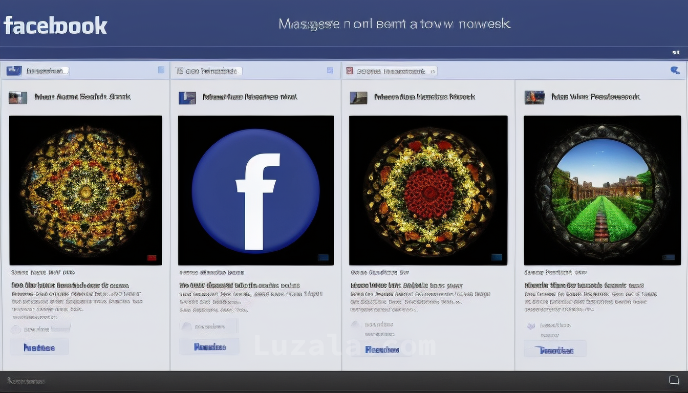
Meta refreshed Facebooks logo, opting for subtle changes to maintain its global recognition. The goal was a bolder yet familiar look, preserving a brand already reaching 3.08 billion users monthly.
Meta, the parent company of Facebook, recently embarked on a journey to revamp the social media giant's brand identity. This endeavor undoubtedly involved countless brainstorming sessions, many of which stretched well beyond the conventional working hours. Picture this: conference rooms adorned with whiteboards, serving as canvases for fervent scribbling and frequent erasing. Passionate debates filled the air, with clenched fists pounding tables in defense of proposals against biting critiques. After an extensive collaborative effort, the outcome was unveiled—a new Facebook logo that, well, appears strikingly similar to its predecessor.
In contrast to Twitter's radical transformation into "X," where the iconic blue bird was replaced with a minimalist black-and-white "X," Meta opted for a more subtle approach. Recognizing the unparalleled global recognition of the classic white "f" on a blue background, the Facebook team decided to retain this familiar symbol, albeit with a few understated modifications.
The team articulated their approach as follows: "Our aim was to craft a refreshed Facebook logo that exuded boldness, electricity, and timelessness. These nuanced refinements were strategically implemented to enhance cohesiveness throughout the design, a pivotal element of the app's identity. We achieved this by embracing a more assertive rendition of Facebook's quintessential blue color, enhancing its visual accessibility within the app and ensuring the 'f' stood out more prominently."
In essence, their approach can be distilled down to "Bigger 'f,' darker blue."
Dave N., Facebook's Director of Design, elucidated that the team's objective was to "build upon our existing foundation and establish the defining hallmark of our brand, serving as the linchpin for our identity system across Facebook." He further stated, "Our goal was to maintain a sense of familiarity while infusing dynamism, sophistication, and elegance into the execution. These subtle yet substantial alterations enabled us to achieve optical equilibrium with a forward-thinking aesthetic."
Notably, the Facebook wordmark also underwent a redesign to ensure consistency and enhance legibility. Although the changes may appear inconspicuous, they contributed to forging a more harmonious relationship between the wordmark and the overall typeface while preserving the brand's historical identity.
These refinements, though nuanced, represent a prudent strategy for a brand that is already thriving. With a staggering 3.08 billion users, equating to 38.4% of the world's population, who access their Facebook accounts at least once a month, Meta's decision to tread lightly while evolving its iconic logo is evidently well-founded.
Download your fonts:
Baginda Script Font - Free Download
The Artisan Font - Free Download
La Beauties Font - Free Download
Bomber Dreams Font - Free Download


Comments